
.blog Academy → Step 7: Website Experience & Visual Flow
→ Step 7D: Monetization Journey
Designing a space that supports offers, conversions, and sustainable income.
When monetization is part of your goal, your blog takes on a new role.
It’s no longer just a place to share ideas or build connection — it becomes a space where people decide whether to take action.
That action might be:
- buying a product
- booking a service
- subscribing to something paid
- joining a program
- or supporting your work
Good UX is essential here. Not to push people — but to make the path forward clear, confident, and friction-free.
1. Be clear about what you offer
The biggest mistake first-time monetising bloggers make is assuming visitors already understand what they’re selling.
They don’t.
Your blog should make it easy to answer:
- What do you offer?
- Who is it for?
- What problem does it solve?
This doesn’t mean turning your homepage into a sales pitch.
It means signposting your offer clearly and calmly.
A short line like:
“I help X do Y through Z”
goes a long way.
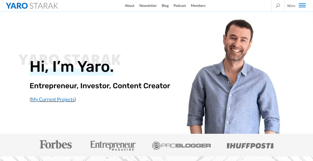
You can see this clarity in blogs like yaro.blog, where the focus and value proposition are immediately visible, helping visitors quickly understand what’s being offered and why it matters.
2. Choose a homepage that guides action
For monetization-focused blogs, a static homepage is usually the better choice.
Why?
Because it lets you:
- explain your value proposition
- introduce your offer(s)
- guide visitors intentionally
Instead of showing everything you’ve ever written, you’re shaping a journey:
Understand → Trust → Act.
Some blogs, like thissweetlife.blog, blend content and offers in a way that keeps inspiration front and centre while still guiding readers toward next steps.
3. Make your offers easy to find (but not intrusive)
If people want to buy from you, they shouldn’t have to hunt.
Good UX makes offers:
- visible
- easy to access
- clearly explained
This might include:
- a menu item like Work With Me, Shop, or Services
- clear calls-to-action at the end of relevant posts
- links placed where they make sense contextually
Avoid cluttering every page with buttons.
Clarity beats urgency.
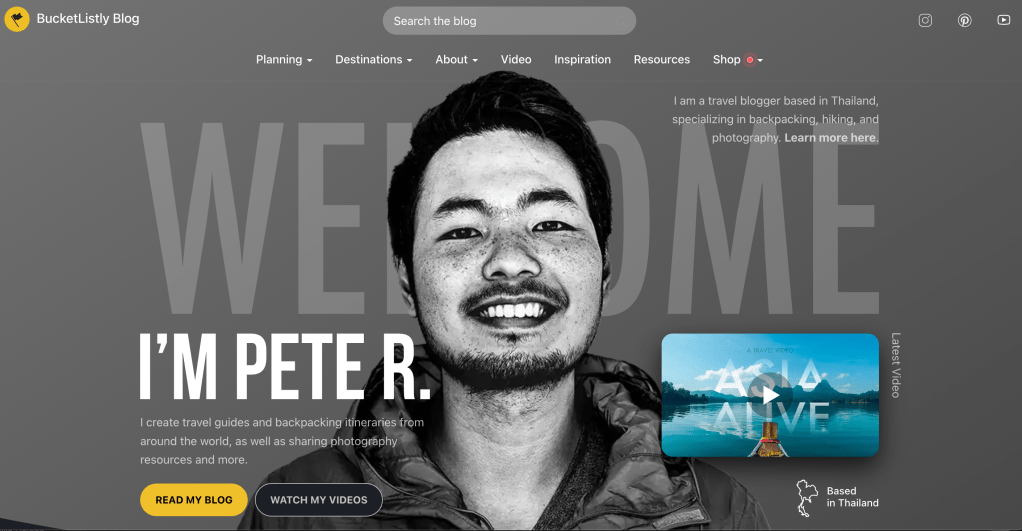
In travel-focused blogs like bucketlistly.blog, monetization is integrated into the navigation and structure — making resources, guides, and recommendations easy to explore without overwhelming the reader.
4. Separate content from conversion
One common pitfall is mixing everything together.
Your blog posts should still serve readers first:
- offering insight
- education
- perspective
- value
Your sales pages, on the other hand, should be focused and intentional.
UX improves dramatically when:
- blog content educates and builds trust
- dedicated pages handle conversion
This separation makes both sides stronger.
Service-led blogs such as annacullen.blog demonstrate how personal storytelling and expertise can live alongside offers — without every piece of content feeling like a pitch.
5. Use categories to support buyer intent
Not all readers are at the same stage.
Some are just discovering you.
Others are actively looking for solutions.
Your content structure can support this by grouping posts around:
- problems
- outcomes
- use cases
- stages of awareness
This helps interested readers naturally move closer to your offer — without pressure.
Product-focused blogs like forthehome.blog often organise content around practical needs and themes, helping readers find what’s relevant to them quickly.
6. Build trust before asking for action
Monetization relies on trust.
Good UX supports trust by making:
- your background easy to find
- your process transparent
- expectations clear
This might include:
- a clear About page
- FAQs
- testimonials or case studies
- clear pricing or next steps
People are far more likely to buy when they feel informed, not rushed.
7. Design calls-to-action that feel natural
Calls-to-action don’t need to be loud.
In fact, they work best when they feel like a logical next step.
For example:
- “If you’d like help with this, here’s how we can work together.”
- “This is something I help clients with.”
- “You can explore my services here.”
Good UX places these moments where interest already exists — not randomly.
8. Make the buying experience simple
Once someone decides to act, the process should be smooth.
Check that:
- pages load clearly
- pricing is understandable
- next steps are obvious
- forms are simple
- there’s no unnecessary friction
Every extra step is a chance for doubt to creep in.
9. Remember: monetization is a journey, not a switch
Very few blogs monetise instantly.
Most successful monetization-focused blogs grow through:
- consistency
- clarity
- trust
- iteration
Your UX should be flexible enough to evolve as your offers evolve.
Start simple.
Refine as you learn.
Your Turn
1. Write one sentence that explains what you offer.
If it’s hard to articulate, it will be hard for visitors to understand.
2. Review your homepage.
Does it guide visitors toward your offer — or hide it?
3. Check your navigation.
Is there a clear path to services, products, or ways to work with you?
4. Look at one blog post with fresh eyes.
Is there a natural moment where a reader might want next-step support?
Up Next in the .blog Academy
Next, we’ll move from structure to visibility.
Step 8 is all about getting found online — exploring how readers discover blogs, which channels matter, the role of search, social, and advertising, and how to grow your reach intentionally.